Don’t Work Backwards
To effectively get your message understood by your audience, it is important to figure out what you want to convey before creating your actual webinar slides. When you know exactly what you want your audience to learn on a webinar slide by slide basis, you can successfully construct a presentation that will demonstrate just that.
Don’t Distract Your Audience
It is important to remember that, generally, people have a very short attention span. Therefore, when a new screen appears with multiple bullet points, your audience will likely focus on reading all of your bullet points, rather than listening to you speak. Consider incorporating webinar slide-builds, to allow one point to show up at a time, as you speak to that point. Using this method, the visual and audio portions of your presentation are coordinated, and give your audience only a harmonized focus. Also, stay clear of transition over load, this could quickly become distracting to your audience.
Don’t Overwhelm Your Audience
Do not, I repeat, do not put paragraphs into your presentations. If you have documents that you want your audience to read, provide them separately. Paragraphs during a presentation will not only distract your audience, but will overwhelm them with information which will eventually cause them to tune out.
Don’t Forget About Simple Aesthetics
While there are many ways to make your presentation appear flashier or more interesting, we recommend sticking to the basics.
-
Font: Make sure you are using an easy to read font in a large enough size.
-
Colours: Using contrasting backgrounds and fonts will be easiest to read and will be most appealing to the eye.
-
Alignment: Avoid centering your text. Generally, your webinar slides will appear more polished if you align the text to the left or right.
-
Clutter: The simplest and most forgotten tip is to avoid clutter. Limit yourself to a couple of bullet points per webinar slide.
-
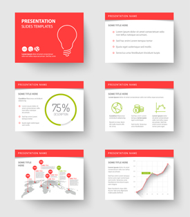
Imagery: The adage, a picture is worth a thousand words, definitely applies to presentations. Too much text can overwhelm and bore your audience. Keep your audience engaged with graphs, pictures and diagrams.


Join or login to leave a comment
JOIN LOGIN