We’re getting very excited over here at the offices of Xtalks.com — our user base has been growing at an unprecedented rate over the last year. While adjustments to our marketing strategy and the inclusion of more content have contributed to that growth, our massive website upgrade in 2017 undoubtedly had the greatest impact on our growth rate. Revamping our website was an enormous financial undertaking but it was worth every penny.
If you’re reading this article I’m assuming that you, as a marketer, might be considering a change to your own website too. Even if you aren’t, my hope here is to persuade you that if you haven’t addressed these three key elements of your website recently,
- Design
- Accessibility
- Interactivity
you might be missing a huge growth opportunity.
The Move from Old to New
For those of you who visited Xtalks over five years ago, you may remember that there was no section of Xtalks.com dedicated to editorial content, topic-based categories, searchable webinar calendars or suggested webinars. Xtalks.com was just one large calendar of upcoming or recorded webinars. Over time, we slowly introduced a few of those features on the older version of the website, sometimes in a limited capacity due to the basic structure of our website and a limited ability to actually code those new features.
The massive overhaul of Xtalks in 2017 introduced a wide range of new features which were aimed at enhancing the user experience through better design, accessibility and interactivity. Let’s take a deeper dive into each of those areas of our design so that you can see what we’ve done. I hope you are inspired to take these ideas back to your company.
Design
Truthfully, it wouldn’t have been too difficult to enhance the design of our old site. Simply shifting to a simple but modern template would have had an impact. As you can see, it was desperately in need of a facelift.
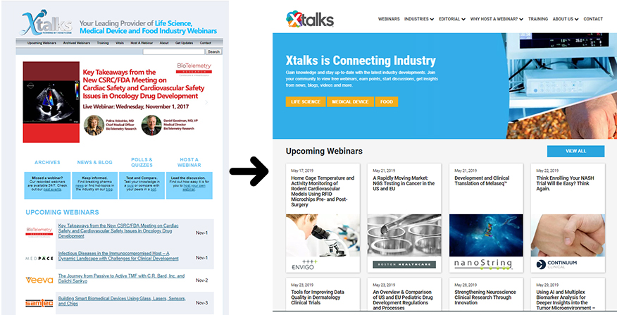
For our updated version of Xtalks.com, text-based links for webinars were replaced by more visually prominent tiles. Webinars were maintained as being front and center on the website. The “hero” image for each webinar is one of the most prominent features of a tile.

The same type of image-based tiles were employed for our editorial section, Xtalks Vitals — consisting of image prominent tiles for news, blogs, quizzes and polls and videos. During the last year, these were improved for better consistency and engagement throughout the website.

Why opt for an image-heavy design in the first place? Studies show that incorporating visuals into media can achieve 94 percent more total views online and according to this research, 93 percent of the most engaging posts on Facebook are image-based. The success of Instagram is also a great example of how we are drawn more to images than we are to text.
If you’re wondering if users will remember visiting your website, consider this fact: the average person will read only 20 percent of a webpage but are likely to view every image. As well, people’s willingness to view content increases by 80 percent when text is paired with coloured images.
Design plays a critical role in giving a website credibility. According to research from Stanford University and Consumer WebWatch, nearly half of 2,500 site evaluators commented on design look (layout, typography, white space, color schemes and other factors) when evaluating the credibility of a website. Images and graphics can obviously play a very large role in design.
If you’re interested in learning more from the study, I’ve included additional data below:
Table 1.0 How often participants commented on various issues when evaluating the credibility of web sites
- 46.1% Design Look
- 28.5% Information Design/Structure
- 25.1% Information Focus
- 15.5% Company Motive
- 14.8% Information Usefulness
- 14.3% Information Accuracy
- 14.1% Name Recognition and Reputation
- 13.8% Advertising
- 11.6% Information Bias
- 9.0% Writing Tone
- 8.8% Identity of Site Operator
- 8.6% Site Functionality
- 6.4% Customer Service
- 4.6% Past Experience with Site
- 3.7% Information Clarity
- 3.6% Performance on Test by User
- 3.6% Readability
- 3.4% Affiliations
Other elements of design consideration like typography and colour schemes were assessed in the Xtalks rebranding initiative. This is a topic that deserves more attention than will be delivered in this blog post, but let’s point out the most obvious. Any long-term users will have noticed that we redesigned our old logo to a new version that represents the many burgeoning communities and topic areas of Xtalks.

Our hope here was to communicate a modern, fun and interesting logo that has helped us evolve beyond our previous identity. Design considerations like layout and whitespace were not our strengths – so we let our web designers take the lead for those components.
As a result of our design changes we saw a 25% drop in our bounce rate .
Accessibility
Organizing Content
As we began expanding our content on the older version of the website, it became apparent that we needed a way to organize it to best serve our audience.
To address the issue, we began by sorting our webinars by date and then by broad topic area. This created categories like:
After we implemented the change, website analytics revealed that a good number of our visitors were using these broad topics areas to find webinars of interest. So, for the updated version of the website we decided to keep this feature, but also expanded the functionality by including keyword tags for more specific webinar topics.

Our editorial content was made to be organized in a very similar manner, so that related content could be found more easily. Since the content from our editorial offerings were designed to work synergistically with our webinar content, we made sure that we could easily pair content by topic. In doing so, you will find that if you’re reading a news article on medical devices, you may also see a related webinar on clinical trials through our related webinars module.
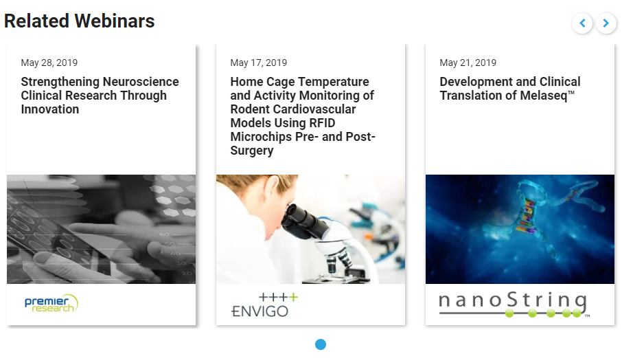
These methods have helped to increase the conversion of a casual visitor to a member who uses Xtalks.com as their primary industry information resource.
Creating a Membership Platform
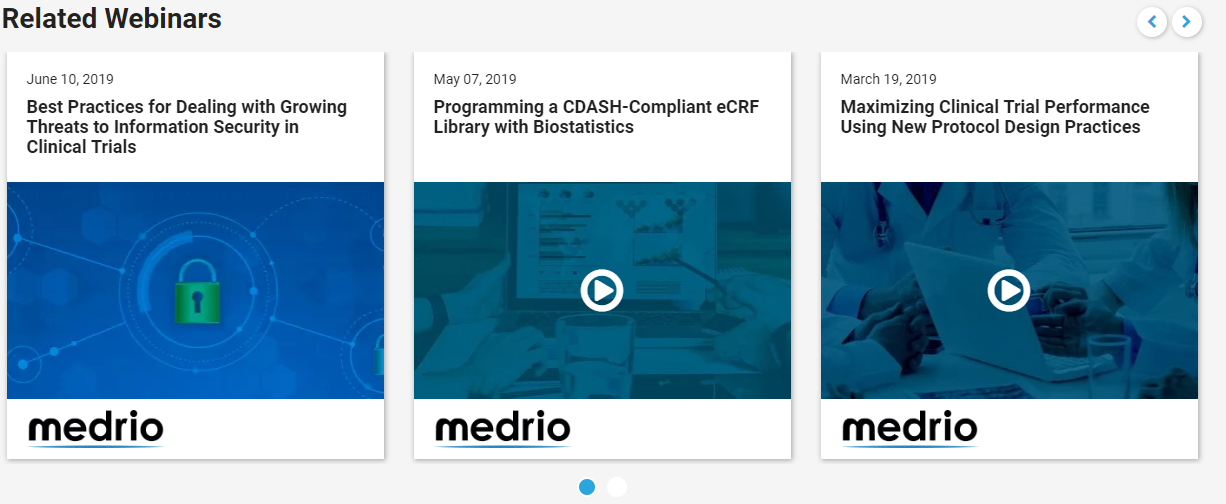
For webinar registrations, not only did the placement of the webinar registration buttons need to be considered, but webinar registration flow needed to be carefully reconsidered. For the redesign we made sure that items like first name, last name, email, organization and job title — all standard fields for a webinar — were pre-completed for users for every webinar. Using this methodology, users can register for webinars much more rapidly, retrieve and watch their recorded webinars and view their upcoming webinars easily through their individual profile page. This change resulted in an increase in webinar registrations per user. An additional function to find quick access to webinars from the same sponsor was also added pre- and post-registration via the related webinars module.
Searchability
Searchability is also key for every modern website, so we made sure to employ a search bar that is always available at the top of the website, but also deploy a search bar for both editorial and webinar content areas.

Mobile Responsiveness
Mobile responsiveness is a primary key to an easily accessible website. In 2018, more than half of all web traffic was on a mobile device. Xtalks isn’t quite meeting that statistic, as we’re reporting about 40 percent of our web traffic being served on mobile devices. Nonetheless, that’s a significant amount, so making sure that text size, images and the arrangement of calls-to-action were easily accessible when viewing Xtalks content via a mobile device.
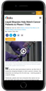
Moreover, maintaining the tile design from desktop to mobile enables our users to feel like they’re experiencing a cohesive website; a website that feels comfortable and familiar whether you’re sitting at your office desk or taking the bus.
As a result of these measures we’ve seen our statistics on returning visitors increase steadily and have increased our average session duration and pages per visit significantly.
Page Loads and SEO
Back in 2017, the older version of the website wasn’t able keep pace with competitive page load times of under 3 seconds. An average page load time in our industry hovers around 9 seconds. Thankfully, our web design team addressed this issue during development. To keep page load times down, we did everything from splurging on a higher-end server to caching data, compressing images and more. As a result of our efforts, we saw our average page load time drop by over 60 percent. Google has signified that page load time is one of the signals used by its algorithm to rank pages on search, so we know that this along with our other SEO efforts, will continue to be a very important factor moving forward.
Interactivity
Improving the ability for users to interact with Xtalks.com has been an ongoing and ever-changing effort. This means automating components of our communications so we could service a greater volume of inquiries from our users and optimize the different types of interactions that were occurring on our website. We added a marketing automations platform to assist us with these efforts. Since this added greater flexibility and freed up staff resources, we’ve identified opportunities from website analytics to carry out more effective and helpful messaging with our users. This means being able to better identify which users are interested about certain topics. Automating components of the website also meant being able to not only suggest content more effectively either through our Suggested Webinars and Suggested Vitals module but also through email messages for timely webinar invitations.
In fact, our suggested webinars section has become one of the most popular pages on the entire website.
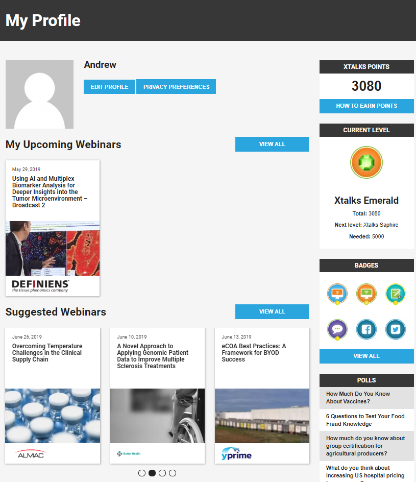
As our marketing automations platform has seemingly endless abilities, we’re becoming increasingly excited to optimize our interactions with members. As an automation tool can’t serve every type of inquiry, we made sure to implement a live chat with live staff members to quickly address anyone on our site with a question.
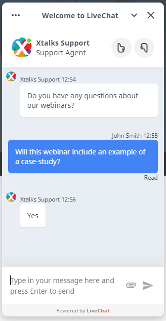
We’ve seen our interactions with visitors increase dramatically after we implemented our live chat – and we believe it is making a big difference in the ability to deliver a quality service to our members.
Looking to the Future
These improvements were aimed at increasing the appeal and use of Xtalks.com as a tool for our existing membership. Thankfully, these tactics have paid off, as we’re growing our membership at the most rapid pace we’ve ever seen. As we continue to improve the interface and offerings of Xtalks.com, we expect this pace to increase even more. Now that we’ve had a chance to optimize our process using the new website and with several new modules of Xtalks soon to be rolled out, we’re excited to see what we can do to better serve the life science, medical device and food industries.
We hope you enjoy our updated look, feel and functionality. As Xtalks.com approaches its 15th birthday, we expect even more growth as we break new ground in digital media. Stay tuned for new projects on the horizon. If you’re interested in getting your brand in front of professionals from the life science, medical device or food industry, be sure to get in touch.




Join or login to leave a comment
JOIN LOGIN