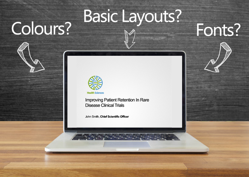
So you’ve compiled all of your slides, graphical data and presenter notes – but your presentation seems to fall flat prior to submission for your upcoming webinar. You’d like to dress up your presentation a little bit more but you’re tight on resources and do not have a designer or company template. Fear not – here’s a brief and easy graphical overview and some tips that can help you jazz up your slide deck!
Basic Layout & Slides:
Before we go any further, let’s make sure you have your basics covered.
The Basics – A checklist:
- Opening Slide (Your name, designation, company logo, etc.)
- Agenda slide
- Conclusion slide
- Contact Slide
On Each Slide:
- Logo
- Slide Number
- Website (optional)
- Copyright
Which Font Do I Use?
Use safe fonts, so when your presentation is shared amongst other colleagues or when you edit it on another computer, you won’t be hassled by automatic replacement of fonts when the current font isn’t available. Here is an overview of fonts that are available in PowerPoint across all operating systems (Windows XP, Vista, Mac OSx, Linux) – and their styles to give you a feel of how it can impact the overall design of your slides:
Not concerned about sharing your slide deck or compatibility? (check with your Xtalks production team first) Want something that looks better? Here’s some recommendations:
Great! Now, What About Colours?
Ok, so you have your font and basics covered. When it comes to colours – let’s start with your background.
White The easiest to work with, no work and probably the best to stick to if you do not have the luxury of time.Off Grey You can never go wrong with off grey. However, if your logos or other graphics have differently coloured backgrounds, your images won’t be seamless with your background. If that is the case, you can easily remove white background in Powerpoint itself. Splash with a little bit of design. We wouldn’t recommend using any other colour, unless it is for your opening and closing slide. If you choose to create simple shapes for design, you should do so with colours similar to your logo. |
|
What Colour Should I Choose?
Colours are always tricky. Choose no more than 3 colours to jazz up your presentation. For starters – pick colours from your logo. In this instance, the eye dropper tool is your best friend. Here are some examples to show how simple it is to pick colours of your logo for your PowerPoint:
Or simply – use Microsoft colours; you can’t go wrong with these! These colours are already complimentary to one another.
Perfect! How Else Can I Jazz It Up?
Use of Icons.
Icons are very versatile to use. Just pop them beside your paragraph or main points. See an example below.
Use of Images.
They Tell A Story – Images are always great visual aids – apart from data and graphs.
Here are some examples on how you can layout your images.
Quotes
Way too much information? Stop for a minute and give your audiences a breather. You can do so by adding quotes, or even a polling question. Read our comprehensive article on A Guide to Webinar Poll Questions.
Do you like the design of the examples shown above? Download our free template here by filling out the form below and subscribe to our Webinar Production Tips Blog! (We’ll send you an email to confirm your subscription.)
So those are a few basic points to enhance your presentation. Do you have any design ideas of your own? Please help out the Xtalks community and share with us in the comment section below. If your company is thinking about running a webinar with Xtalks, contact us, or check out our sponsorship opportunities.


Join or login to leave a comment
JOIN LOGIN