
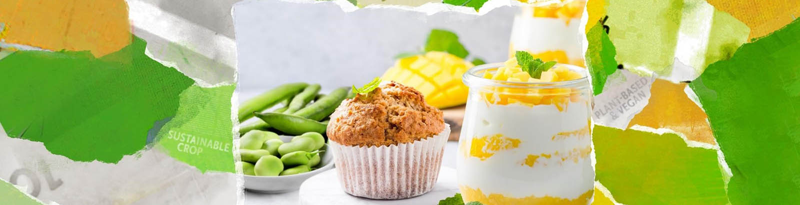
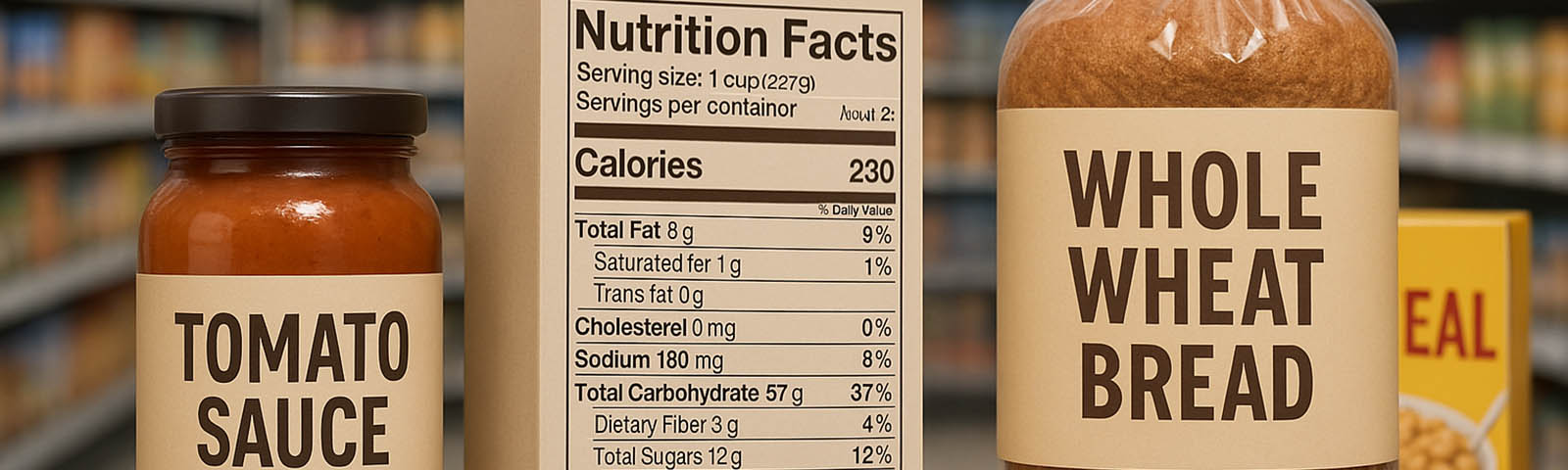
As consumers look for more wholesome, natural and simple ingredients in their foods, manufacturers are reinventing their products to have these qualities and looking for ways to advertise their new ingredients on their packaging. With packaging being a key selling tool for products, some companies are redesigning their brands in order to have a simple and clean look with key messaging. Major food organizations like Jeni’s Ice Cream, No Cow, Farmhand Organic and Essentia have recently undergone a packaging makeover.
Jeni’s Ice Cream
Jeni’s gourmet ice cream recently underwent a packaging makeover in October. Seven of their popular flavors were selected for the new design. By incorporating bright colors and simple large text, the company was able to create an eye-catching design that is easily legible for consumers. Their redesign was primarily guided by what would look good on social media, as many consumers now learn about new products on applications like Instagram and Facebook. The ice cream maker’s original design involves simple handwritten-style script with a white background. The new design incorporates bright colors and some traits from the original packaging.
“In a nod to our original plastic pints, every flavor name is written in a unique, handwritten script. Underneath is the flavor description highlighting the amazing ingredients inside. On the side are stories from me about the flavor—from inspiration to process to partners. Read this panel if you want to go a little deeper. And, as usual, our ingredients are printed large because we are so proud of everything in there,” Jeni Britton Bauer, Founder of Jeni’s, wrote in her company’s blog.
No Cow
No Cow, formerly known as D’s Naturals, underwent a name and package design change after catching the attention of General Mills and 2X Consumer partners in the spring. The maker of dairy-free protein bars is expanding from the bar category to provide more high-protein, dairy-free products in January 2018. To kick off the launch of their growing portfolio, No Cow redesigned both its packaging and logo. Their products are now wrapped in simple, white packaging with key messaging. Their new logo – a single leaf in a circle – is designed to represent the plant-based protein inside the bar.
“By transitioning to No Cow, we’re signaling our brand evolution but are staying true to our mission of creating a true No Cow Revolution,” founder Daniel Katz said in a statement. “No Cow is no longer just a protein bar company; we are quickly becoming the trusted brand in all things dairy free, low sugar and high protein.”
Farmhand Organics
Formerly known as MM Local, Farmhand Organics changed its logo, name and packaging in November. The eight-year-old company is known for their pickled vegetables, probiotic kimchi, probiotic sauerkrauts and condiments. Their newest design features transparent packaging, bold titles and key messaging.
“We built our company on a foundation of quality local food sourced from organic family farms we are proud to partner with,” said Jim Mills, founder and CEO of MM Local, now Farmhand Organics. “We are excited to have a new name and brand that starts to tells our story while broadening our horizon for reach, impact and growth.”
Essentia
In spring, ionized alkaline water brand, Essentia Water, announced a new logo and the start of an integrated marketing campaign for their product. Their new packaging has the enlarged new logo and three key messages – 9.5 pH or higher, purified water and ionized hydration.
“The new packaging showcases Essentia’s bold, impactful and aspirational brand in an innovative and consumer-friendly design, bringing the brand personality to life and communicating what the brand stands for,” says Karyn Abrahamson, VP of marketing and brand innovation at Essentia.
“This new packaging approach makes the product stand out at retail and makes the shopability simplified and more engaging.”
Packaging has proven to be a key marketing tool for brands and many food manufacturers are realizing this. All four companies redesigned their brands to have a modern yet simple look. Key messaging is highlighted and logos are enlarged and more visible in all four products. These packaging patterns are evident in many new foods as consumers turn towards simple ingredients and cleaner wrapping.


Join or login to leave a comment
JOIN LOGIN